

This bold red 'G.' is my current logo. As a copywriter emerging into the workforce, I want my logo to say 'copywriter'. I went with a simple bolded initial and a period in bright red because I feel as though this design reflects my boldness as well as encapsulates that I am a writer through the use of the '.'
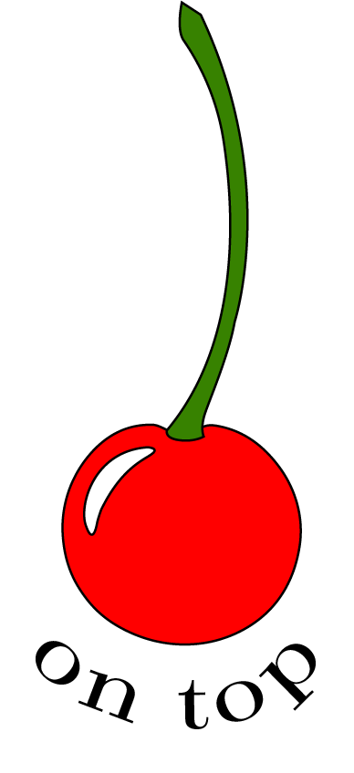
Logo I created for my Advertising Campaigns group, 'Cherry On Top' this semester

Logo I created for a Brand Strategy and Research class. My group came up with an idea for a 100% sustainable fashion brand that is marketed androgynously. I decided to name the brand "ALT" as a reflection of our target audience. Additionally, I made the logo into an ambigram to represent that our brand is versatile and can fit anyone any way.

This logo was my original brand logo I created for myself when I was in art direction. I decided to change it this semester to align better with embodying a copywriter. However, this logo will always have a special place in my heart.
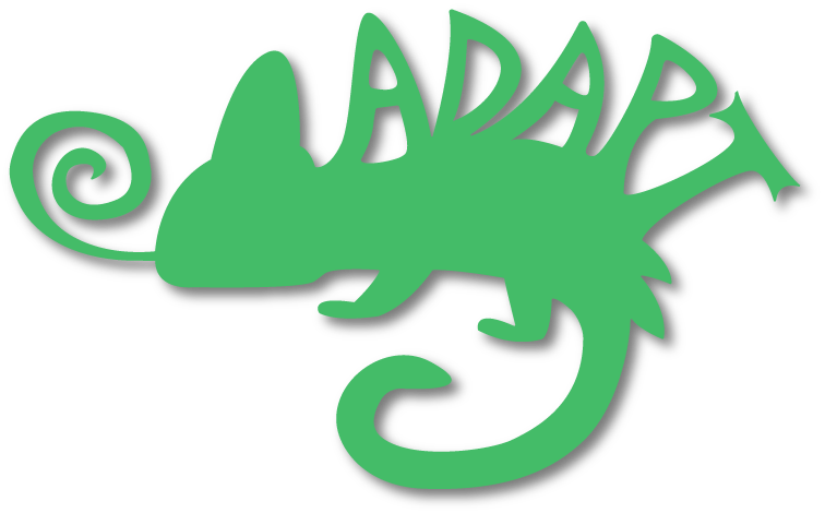
Logo I designed for a student agency called 'ADAPT'. I thought incorporating a chameleon silhouette would be a fun way to make a compelling logo that spoke to what our agency was about — adapting to change.